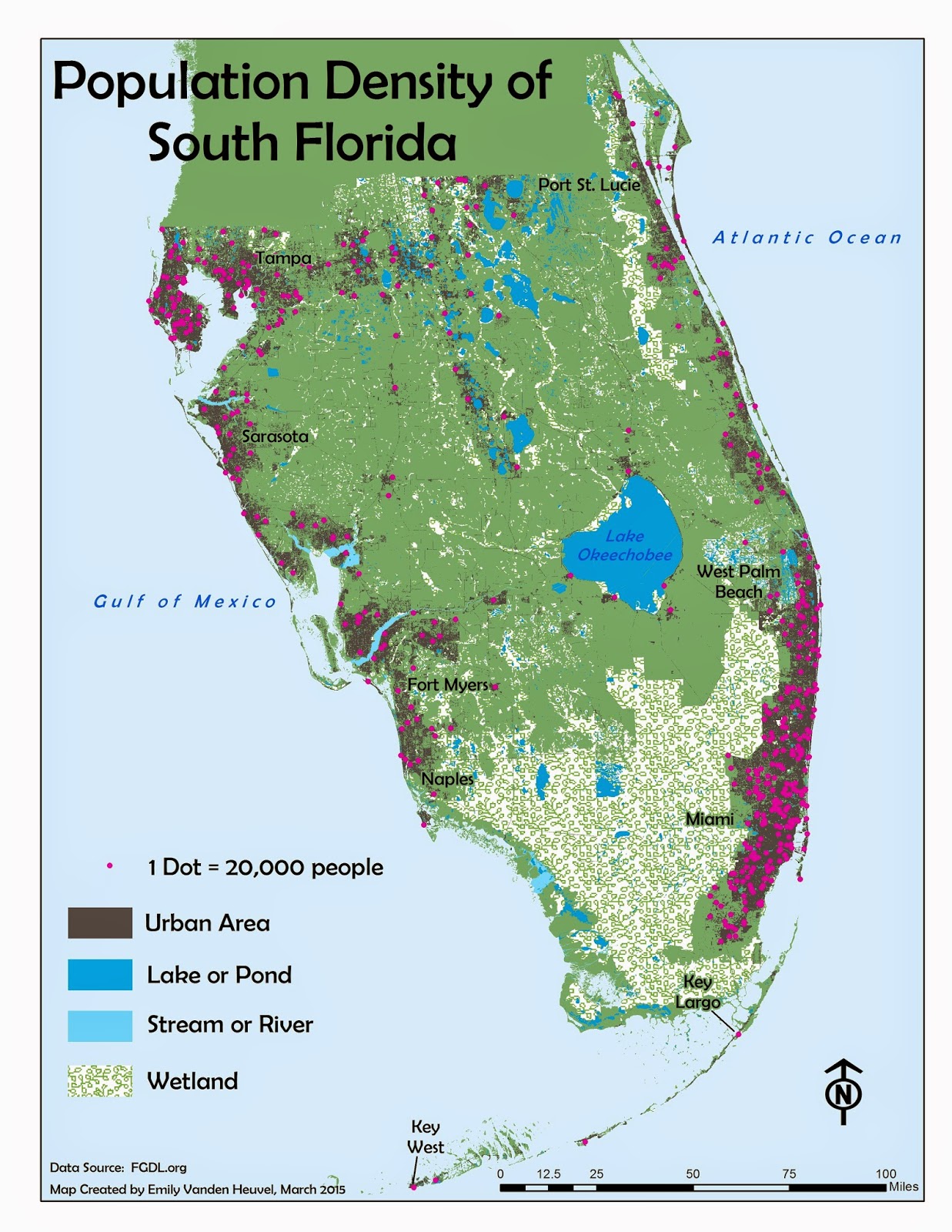
The method of execution here is pretty straightforward- 1 dot equals some amount (such as number of people, in the map above), and the dots are placed in the general location of where the measured amount occurs. The above map also places the dots in the darker shaded "urban areas," which further isolates the general population centers by location. Maps like this are a useful way to depict the density of some discrete phenomenon- like population. This type of map would be inappropriate to use for continuous phenomena, like temperature or precipitation, as those variables do not occur, and thus cannot be measured and isolated, at exact locations. The most densely populated areas of south Florida are along the coasts, with centers in West Palm and Miami/Ft. Lauderdale in the east, and Tampa, Sarasota and Ft. Myers/Naples in the west. This pattern is easily and simply visible with the locations of the representative dots in the above map.
As a side note, it probably wasn't necessary to include a label for Naples in this map, but I couldn't help myself and added it anyway. Ft. Myers is a bigger city, and more of the population's center, but Naples is my home, and thus my personal center locale. I suppose there is, to some extent, a least a bit of subjective reasoning one can allow for in these situations- or at least I hope that there is. Maps are, after all, generally rather scientific in nature, but still created by human beings...
No comments:
Post a Comment