The classification of the pixels that compose a remotely-sensed raster image into land use/land cover categories- such as forest/trees, grass, buildings/roads, etc.- is primarily accomplished via "supervised" or "unsupervised" classification processes. "Supervised" classification involves the creation of categories of land use/cover, and subsequent assignment of image pixels to each category, mainly by way of manual determination by an image analyst. "Unsupervised" classification, on the other hand, begins with a computer algorithm assignment of image pixels into a pre-defined number of class types, and a subsequent determination by an analyst what each class represents and whether the computer-assigned classes for the pixels are accurate.

The above image includes five feature class types, with each pixel assigned to each class by the computer algorithm, which clusters pixels according to their number values in each band layer. The algorithm initially produced 50 different classes, which were then manually condensed into the five seen above. The total surface area for each class was then calculated, and the impermeable and permeable surface areas as well.
The plethora of earth's physical features that can be identified by way of multi-spectral, remotely-sensed images is endless. Different band (wavelength) combinations, and display of specific bands symbolized in unique ways, allow for all manner of object identification. "False color" band combinations, for instance, can be used to detect areas of normal and abnormal vegetative growth- identified by the way in which these areas absorb and reflect different wavelengths of radiation.
The above image, using Landsat ETM+ thermal band 6, allows for the identification of forest fires- depicted as bright yellow pixels in the north-east quadrant of the image. Band 6, the thermal infrared (IR) layer of the multi-spectral image, can be "stretched" along a color ramp, such that the "coolest" (lowest) pixel values are at one end of the spectrum, and those highest ("warmest") values are at the other extreme. The colors in this image are stretched in a manner that conveys the warmest portions of this remotely-sensed area (the parts that are literally on fire) are displayed as an entirely different color than the other (non-burning) parts of the area- making the fires immediately visible within the landscape.
Feature identification in aerial photography and other remotely sensed images is primarily aided by the use of multiple spectral bands, from which features on the earth's surface are classified by comparing and contrasting the information found in each band. Red, green and blue visible electromagnetic radiation (EMR), combined with infrared and near-infrared band layers, all combine to form a multi-spectral snapshot of an area, the radiometric display of which can be manipulated in endless ways.
Some of the ways the multiple spectral bands can be displayed, in order to highlight specific physical features, are depicted in the above graphic. Three different features are identified by way of their spectral characteristics in each spectral band layer- primarily the pixel brightness in each layer of the multiple bands. The pixel values (brightness) in each spectral band layer provide a means of feature classification by way of pixel value comparison across the layers.
While making educated interpretations of land use and cover from remotely-sensed images is all well and good, it is important to consider the fact that some classifications are bound to be erroneous. User error is endemic to any variety of image interpretation, and to any application of human interpretation of anything, really. How we classify and interpret these errors is of the utmost interest to any G.I.Scientist.

The above aerial image, which was previously classified by land type and use, has been sampled for accuracy in the above map. The sample points were placed within the squares of an overlaid grid, and allow for a spatially-systematic examination of the classification accuracy. This (very simplified) error measurement is a "quick and dirty" method of examining the land classification, and forgoes a lot of the nuances and details produced by an error matrix with attendant measures of producer's and user's accuracy. The relatively uniform spacing and placement of sample points in this assessment may also leave out some of the detailed differences in accuracy between classification categories.
One of the cornerstones of aerial imagery interpretation is arguably the classification of land use and land cover derived from these images. Large swathes of the world can be accurately mapped, with designations for what the land is used for and/or what the land's natural surface is covered with, using methods of aerial imagery classification. These methods mainly rely on the ability of trained interpreters to accurately identify natural and man-made features in a remotely-sensed image.
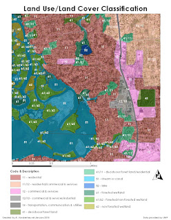
The above image represents land use and land cover classification from an aerial image, using characteristics like color, texture, pattern, shape and association of the various land types and physical features therein. The squares in the photo, for instance, are obviously buildings, and the green-colored, characteristically shaped/textured areas are obviously trees. The challenge really begins at deciding which buildings are houses, and which are commercial areas, or which trees are deciduous, and which are evergreen. This is where the tools gained from experience and/or training allow the interpreter classifying the image to really identify the specific land uses and covers within the aerial image.
When working with any relational database one must necessarily be concerned with the physical design of the database, and how that can be depicted visually in an entity relationship diagram (ERD). The database entities must be related, or connected, by means of primary or foreign keys, and the attributes of each must be listed. Working with spatial data, in particular, for use in a GIS, is done effectively with the use of PostGIS and SQL code. Before the data is created or imported, however, it is typically beneficial to consider an ER diagram, in order to best visualize the data and database. Below is a simple ERD with three entities- parcels, parks, and home sales, with the attributes for each listed as well.
It might be fair to say our country is at a bit of a crossroads, in terms of political parties, and one might contend that gerrymandering, on the part of one party, may have unfairly and unduly influenced the 2016 election's results. What we do know for sure, though, is that spatial data analyses can be greatly influenced by both the size and shape of the boundaries drawn to delineate zones or districts. Political districts in the U.S. are ideally somewhat standardized- districts are optimally shaped with existing administrative boundaries (states, counties, census blocks, etc.) include roughly the same number of people, and encompass neatly contiguous spatial areas. In real life, however, compact and contiguous districts can be broken up by any number of natural features, like water, mountains, and the like, but they can also be dismantled and haphazardly reassembled through gerrymandering, or changing political boundaries with the intent of benefiting someone or something through the changed voting districts. This process inevitably leads to some fairly strangely shaped Congressional Districts in this country, which, because of the properties involved in changing scale and spatial aggregation, can have a rather disproportionate effect on election results.
One measure of voting district "compactness," or the extent to which the zone boundaries are logically shaped, and the area the zone encompasses is contiguous, is called the Polsby-Popper measure. This formula gives the ratio of the zone's area to a circle with the circumference of the zone's perimeter. The idea is that zones with oddly, convoluted shaped boundaries will produce a lower "score" on this measure, and those with smooth and adjacent boundaries will produce one that is higher. The sense that zones do not divide existing political boundaries, namely counties, is another measure that provides an idea of the extent to which these political districts divide existing communities. The direct measure of this can be provided by a count of the counties divided by Congressional Districts, and further a count of those that divide the greatest number of counties.

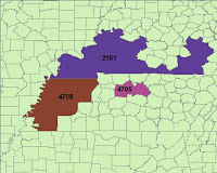
The images above represent two different types of oddly-shaped, non-contiguous districts- the ones on the left result from the natural shape of the areas in question, and the ones on the right are the result of gerrymandering. As one might imagine, the districts on the right scored very low on the Polsby-Popper measure. The haphazard construction and re-drawing of these boundaries changes the nature of the population contained, and, as mentioned, can greatly influence election results. And, if one party does it, the other must necessarily follow suit, and the cycle continues, seemingly ad infinitum... as is apparently the nature of American democracy today.
LiDAR, or light detection and ranging, and SRTM, or the Shuttle Radar Topography Mission, are two different methods of wide-scale generation of DEMs, or digital elevation models. SRTM is a NASA initiative, which aims to provide (relatively) accurate elevation data for (most of) the world, by remotely sensing via space shuttle. LiDAR is a process of collecting surface data by aircraft, which involves radar, and provides a far more detailed- or high resolution- image than most other remote sensing methods. Resolution, which we can derive from the size of the grid cells that compose a raster image, is an important consideration in choosing a DEM, as it can dictate the results of many terrain analyses one might perform using that elevation model.

One terrain derivative one might require from a DEM is slope, a comparison of that which has been derived from the SRTM and the LiDAR data is shown above. One can immediately recognize the lower resolution present in the SRTM image, and the higher degree of accuracy in the LiDAR data. The scale one is working with could clearly influence the results of any spatial analyses performed, as is evidenced clearly from the above- the kind of generalization present in the SRTM data may be acceptable for very large, smaller scale projects, but obviously wouldn't be appropriate for anything requiring any kind of more localized detail.
If one is attempting to find any kind of statistically significant relationship between spatial variables, one might use a local Geographically Weighted Regression (GWR) model, which would attempt to demonstrate that change in one variable promotes a significant amount of change in another. Alternatively, if one were looking to see if two or more variables were correlated, or just related to one another, it might be appropriate to use a global Ordinary Least Squares (OLS) model. Both of these statistical models are specific to spatial analysis, as this type of modelling requires a slightly different perspective on the phenomena being modelled- illustrated conveniently with the spatial autocorrelation assumption inherent in Waldo Tobler's famous quote "Everything is related to everything else, but near things are more related than distant things."
GWR, by definition, involves regression- the modelling of the relationship between dependent and independent variables. Regular statistical regression needn't take into account variables like spatial distribution and physical proximity, though, and thus the addition of "geographically weighted." OLS, on the other hand, involves simpler methods of correlation. When two variables have a statistically significant relationship, that correlation found from running the OLS model can be used to justify performing further GWR analysis. The appropriate model to use for spatial variables depends upon the context and the variables being examined- no one model is superior to another, and there is some amount of subjective measure required in the decision of which one to use in any given situation.
Regression analysis in ArcGIS uses spatial analyses and autocorrelation, with the intention of predicting different facets and characteristics of spatial variables. It is a fairly standard variety of empirical study- wherein one collects data, defines dependent and independent variables, performs all manner of arcane statistical procedures involving both numbers and Greek letters, all with the intent of attempting demonstration that one variable has a measurable positive or negative effect on another.
Issues can arise, however, when one needs some kind of certainty that the regression model employed is accurate and/or non-biased, among other things. Fortunately ArcMap produces a lovely table with all of the calculated numbers required to determine various likelihood of errors, like the "Jarque-Bera" statistic, which gives a measure of model bias. The R-squared and intercept coefficients are included as well, which are also used to determine the validity/reliability of the model.


