Tuesday, November 29, 2016

Spatial Aggregation & Gerrymandering Political Districts

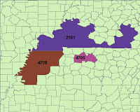
It might be fair to say our country is at a bit of a crossroads, in terms of political parties, and one might contend that gerrymandering, on the part of one party, may have unfairly and unduly influenced the 2016 election's results.  What we do know for sure, though, is that spatial data analyses can be greatly influenced by both the size and shape of the boundaries drawn to delineate zones or districts.  Political districts in the U.S. are ideally somewhat standardized- districts are optimally shaped with existing administrative boundaries (states, counties, census blocks, etc.) include roughly the same number of people, and encompass neatly contiguous spatial areas.  In real life, however, compact and contiguous districts can be broken up by any number of natural features, like water, mountains, and the like, but they can also be dismantled and haphazardly reassembled through gerrymandering, or changing political boundaries with the intent of benefiting someone or something through the changed voting districts.  This process inevitably leads to some fairly strangely shaped Congressional Districts in this country, which, because of the properties involved in changing scale and spatial aggregation, can have a rather disproportionate effect on election results.

One measure of voting district "compactness," or the extent to which the zone boundaries are logically shaped, and the area the zone encompasses is contiguous, is called the Polsby-Popper measure.  This formula gives the ratio of the zone's area to a circle with the circumference of the zone's perimeter.  The idea is that zones with oddly, convoluted shaped boundaries will produce a lower "score" on this measure, and those with smooth and adjacent boundaries will produce one that is higher.  The sense that zones do not divide existing political boundaries, namely counties, is another measure that provides an idea of the extent to which these political districts divide existing communities.  The direct measure of this can be provided by a count of the counties divided by Congressional Districts, and further a count of those that divide the greatest number of counties.


The images above represent two different types of oddly-shaped, non-contiguous districts- the ones on the left result from the natural shape of the areas in question, and the ones on the right are the result of gerrymandering.  As one might imagine, the districts on the right scored very low on the Polsby-Popper measure.  The haphazard construction and re-drawing of these boundaries changes the nature of the population contained, and, as mentioned, can greatly influence election results.  And, if one party does it, the other must necessarily follow suit, and the cycle continues, seemingly ad infinitum... as is apparently the nature of American democracy today.


Monday, November 21, 2016

LiDAR vs. SRTM: Resolution, Accuracy & Scale

LiDAR, or light detection and ranging, and SRTM, or the Shuttle Radar Topography Mission, are two different methods of wide-scale generation of DEMs, or digital elevation models.  SRTM is a NASA initiative, which aims to provide (relatively) accurate elevation data for (most of) the world, by remotely sensing via space shuttle.  LiDAR is a process of collecting surface data by aircraft, which involves radar, and provides a far more detailed- or high resolution- image than most other remote sensing methods.  Resolution, which we can derive from the size of the grid cells that compose a raster image, is an important consideration in choosing a DEM, as it can dictate the results of many terrain analyses one might perform using that elevation model.  


One terrain derivative one might require from a DEM is slope, a comparison of that which has been derived from the SRTM and the LiDAR data is shown above.  One can immediately recognize the lower resolution present in the SRTM image, and the higher degree of accuracy in the LiDAR data.  The scale one is working with could clearly influence the results of any spatial analyses performed, as is evidenced clearly from the above- the kind of generalization present in the SRTM data may be acceptable for very large, smaller scale projects, but obviously wouldn't be appropriate for anything requiring any kind of more localized detail.    

Tuesday, November 15, 2016

Geographically Weighted Regression (GWR) vs. Ordinary Least Squares (OLS)

If one is attempting to find any kind of statistically significant relationship between spatial variables, one might use a local Geographically Weighted Regression (GWR) model, which would attempt to demonstrate that change in one variable promotes a significant amount of change in another.  Alternatively, if one were looking to see if two or more variables were correlated, or just related to one another, it might be appropriate to use a global Ordinary Least Squares (OLS) model.  Both of these statistical models are specific to spatial analysis, as this type of modelling requires a slightly different perspective on the phenomena being modelled- illustrated conveniently with the spatial autocorrelation assumption inherent in Waldo Tobler's famous quote "Everything is related to everything else, but near things are more related than distant things."

GWR, by definition, involves regression- the modelling of the relationship between dependent and independent variables.  Regular statistical regression needn't take into account variables like spatial distribution and physical proximity, though, and thus the addition of "geographically weighted." OLS, on the other hand, involves simpler methods of correlation.  When two variables have a statistically significant relationship, that correlation found from running the OLS model can be used to justify performing further GWR analysis.  The appropriate model to use for spatial variables depends upon the context and the variables being examined- no one model is superior to another, and there is some amount of subjective measure required in the decision of which one to use in any given situation. 

Sunday, November 13, 2016

A(nother) Discussion of Regression Analysis in ArcGIS

Regression analysis in ArcGIS uses spatial analyses and autocorrelation, with the intention of predicting different facets and characteristics of spatial variables.  It is a fairly standard variety of empirical study- wherein one collects data, defines dependent and independent variables, performs all manner of arcane statistical procedures involving both numbers and Greek letters, all with the intent of attempting demonstration that one variable has a measurable positive or negative effect on another.

Issues can arise, however, when one needs some kind of certainty that the regression model employed is accurate and/or non-biased, among other things.  Fortunately ArcMap produces a lovely table with all of the calculated numbers required to determine various likelihood of errors, like the "Jarque-Bera" statistic, which gives a measure of model bias.  The R-squared and intercept coefficients are included as well, which are also used to determine the validity/reliability of the model.


Sunday, October 30, 2016

Regression Analysis to Estimate Missing Values

The availability of data for any type of analysis is necessarily potentially limited, but fortunately there are regression analyses with which one can extrapolate numbers with which to estimate missing values.  One relatively simple method for calculating possible values for those missing is the use of a regression line, which can be used to answer the question "what is the most likely value for Y if given a value for X."  One makes the assumption here that the trend in the data will be the same for the missing values, and that the relationship between X and Y will remain constant.

Year Station B x Station A y
1931 1005.84 1131.97
1932 1148.08 1269.09
1933 691.39 828.84
1934 1328.25 1442.78
1935 1042.42 1167.23
1936 1502.41 1610.67
1937 1027.18 1152.54
1938 995.93 1122.42
1939 1323.59 1438.29
1940 946.19 1074.47
1941 989.58 1116.30
1942 1124.60 1246.45
1943 955.04 1083.00
1944 1215.64 1334.22
1945 1418.22 1529.50
1946 1323.34 1438.04
1947 1391.75 1503.98
1948 1338.97 1453.11
1949 1204.47 1323.45
  
The above table has rainfall values for two weather stations for the years 1931 through 1949.  The values for Station A in this year range were found using the slope and Y-intercept for the relationship between the stations using the values from 1949-2004.  The formula for the regression line is y = bx + a, where b is the slope, a is the Y-intercept, and x is the given value for Station B for that year.  

Saturday, October 22, 2016

Interpolation and DEM Accuracy

The accuracy of continuous raster surfaces relies on the ability of the interpolation method to calculate values for areas between sample points that are as close as possible to the actual measurements.  This is, of course, determined by taking a measure of the difference between a value taken directly from the field and one produced by an interpolation method- the less difference between these two measures, the more accurate the interpolation.  Vertical (elevation) accuracy in DEM data can be influenced by a number of factors, most notably the features of the ground cover, as these can influence and obscure remotely sensed images and data.  Bias and uncertainty can be introduced rather easily into a data set, and can lead to systematic over or underestimation.  Looking at the summary statistics of the differences between measured and interpolated values for different methods may look something like this:


IDW elevation
Spline elevation
Kriging elevation
mean (m)
-1.544
-2.365
-1.967
standard deviation (m)
11.695
10.196
12.024
median (m)
-1.759
-1.838
-2.144

The interpolation methods across the top- Inverse Distance Weighting (IDW), spline and kriging- produced elevation values for 63 different points that were then compared to the actual elevations, and the differences between the values are summarized in the table above.  The method with the lowest mean difference- IDW- could be argued as superior to the others, as it produces values that are, on average, closer to the actual measure.    

Sunday, October 16, 2016

Estimating Values for Unsampled Areas: Surface Interpolation

Many different phenomena are represented on maps as being continuous across a large surface area, despite the fact that the measurement for whatever is being depicted is necessarily taken from a set of discrete, measured point locations.  A news station weather map of north America, for example, might show areas with more precipitation or higher temperature in different colors across the map.  The methods used to estimate the values of some variable(s) in locations where samples are not directly taken from, based upon the values of sampled points in the proximity, is called spatial interpolation.  There are a plethora of different interpolation methods, differing in complexity and difficulty to execute, and each has its own strengths and weaknesses.  Thiessen polygons and Inverse Distance Weighting (IDW), for example, are relatively simple interpolation methods, and are somewhat easier to perform.  More sophisticated methods, like splining or kriging, which use spatial statistics in their calculations, may be preferable if a higher degree of accuracy is required.


The above map depicts concentrations of biochemical oxygen demand (BOD) in Tampa Bay, and is generated from sample data that goes with each of the point locations.  IDW is the interpolation method used to generate the above raster surface, which shows the estimation of concentrations across the bay based on the measurements at the sample points.  IDW is a relatively simple and common measure, but it is valuable in a number of spatial analysis scenarios.  This, and most other interpolation methods, rely on the assumption of autocorrelation- that what is nearer is more alike than what is further away.  Although IDW is an adequate and appropriate method of interpolation in this application, it may not be appropriate for every situation- the choice of method is based upon the characteristics of the application.

Sunday, October 9, 2016

Elevation data: TIN vs. DEM (the vector/raster dichotomy epitomised)

In the world of geographic information science there exists two primary kinds of data- vector and raster.  The differences between the two could be discussed to no end, and everyone has their preference, but for some applications one can be simply superior to the other.  A  rather perfect example of this dyad is the comparison of elevation depicted with a vector TIN data set vs. that which is displayed with a raster DEM.  The triangular irregular network (TIN) is created from a series of elevation measurements called 'mass points,' which are connected with 'breaklines,' and elevations are interpolated from these.  The digital elevation model (DEM) is a digital representation of topography, which is displayed with a grid of spot heights, and is a widely used type of raster image.  Contour lines are a standard 2D representation of elevation, and can be created in ArcGIS from either a TIN or a DEM data set.


Above is an image with contour lines created from the same area, one set created from a TIN, and one from a DEM.  The most immediately notable difference between the two sets of lines is that the TIN contours are more angular, and don't curve in the same way as those created from the DEM.  This is somewhat logical, given that the TIN consists of discrete triangles, whereas the DEM represents a more continuous surface of values.  Because elevation is a more continuous phenomena- it's not delineated in nature with discrete lines- one might contend that the DEM provides the superior representation.  The TIN data lacks the more nuanced variations in values, which allow for the curved contour lines.  Thus it could be concluded that though vector data is invaluable in many situations, a raster image is somewhat preferable in the examination of phenomena like elevation.   

Sunday, October 2, 2016

Location-Allocation Modeling

Anyone who has ever wondered how, exactly, it is decided just where things like new schools, new stores or other facilities will be located has considered a problem of location-allocation.  In making these decisions, which mainly involve analysis of things like travel cost, distance, and customer locations, a multitude of factors must be considered, and locations are decided upon based on their suitability.


Above is a comparison of market area assignment to distribution centers- both before and after the location-allocation model.  Each of the 22 distribution center points serves the market areas, based upon customer locations.  After the location analysis, the market area assignments are improved, as the number of customers within each and the distribution centers they use have been optimized according to our specified criteria.

Sunday, September 25, 2016

Vehicle Routing, Round 2

Road networks are complicated bastions of all manner of spatial quandaries, most notably, for our purposes, those involving vehicle routing.  There is no end to the permutations of various circumstances these kinds of problems can involve, and knowledge of some of their more common manifestations is invaluable.  When these problems involve ordered pairs of pick ups and drop offs, there are a multitude of parameters we can specify to maintain various characteristics of our intended route- time windows, driver breaks, wheelchair access (if required), distance, etc.  According to the specifications we input the actual resulting route can vary widely.


Above is one solution (series of routes) to a routing problem involving pick ups and drop offs of people at locations in south Florida. The parameters used to create these routes include drop off and pick up time windows, maximum working hours and breaks for drivers, and route zones, which constrain where certain routes can travel.  The initial routing solution created for the above had constraints which produced an output with five "unassigned" locations, which were not assigned to any of the routes.  The second solution, shown above, modified the parameters such that two additional vehicles/routes were included, which eliminated the unassigned locations.  The customer service aspect of this modification is notable with regards to this routing problem- the ability to include all of the desired stops, which the second set of routes (above) does, increases the number of customers served, which is obviously beneficial.  Additionally, the extra routes may relieve some of the burden on the rest of the vehicles, allowing more flexibility in service times, which also benefits the customer.  

Sunday, September 18, 2016

Road Networks and Vehicle Routing

Road networks are a feature of the landscape that is rife with potential for spatial analysis, and one of the more common problems involving these networks is the challenge of creating an appropriate vehicle route.  The time it takes a vehicle to get from point A to B varies according to a plethora of factors, including speed limit, road size, traffic patterns, etc., and the route chosen for the vehicle may need to take any number of these factors into consideration.


The above route maps are similar to one another, but the two do actually vary slightly.  The map on the left is identical to the one on the right, except that its route was created using rules involving traffic data, which changed the route, and actually added about an hour onto its travel time.  This kind of route optimization is invaluable to those who plan these kinds of routes- the more factors one can take into account when creating something like this, generally the better.     

Sunday, September 11, 2016

Road Networks and the Spectre of Exhaustive Data Completeness

Spatial data is, ideally, completely representative of the real-world entities it is portraying.  In reality there is necessarily some amount of generalization inherent to any spatial data, a result of translating and scaling it for its practical use.  The perfectly complete data set is a very rare entity, and road networks like TIGER, TeleAtlas, and locally sourced street centerlines more often than not exclude some amount of road segments that are actually present.  This exclusion results from things like conscious decisions to leave smaller, privately-owned roads out of the data set, and errors of omission in data digitizing/collection procedures.  


The above represents a county and two different road network data sets- one from the census bureau's TIGER database, and another with locally collected street centerline locations.  A 1 km by 1 km grid is overlaid, in order to systematically derive a spatially comparable measure of each data set's relative completeness.  The total length of road segments within each grid cell can be compared between the two, and a measure of the magnitude of difference between the two is depicted with the choropleth map above.  Thus we can conclude that the TIGER data set is more complete than the street centerlines, as it contains a larger amount of total road segments- which is our sole qualifier for data comprehensiveness.  The caveat to that is, of course, that we may wish to consider other factors in gauging the data's relative "completeness."  If the TIGER data contains more driveways and non-navigable road segments, for example, we may wish to reevaluate our definition of "complete," as the superior accuracy of the other street centerline data renders it somewhat more "complete" than the TIGER, so to speak.     

Sunday, September 4, 2016

Adventures in Metadata

This week's exercise in Data Quality includes examination of various data standards, namely the National Standard for Spatial Data Accuracy (NSSDA) and the older National Map Accuracy Standards (NMAS), which indicate the data set's accuracy, and are typically found in its metadata.  The actual procedure described in the NSSDA involves taking sample points from a test data set and a known, highly accurate reference value, and produces a value that indicates the tested data's horizontal or vertical accuracy at a 95% confidence level.


Above is a map, which includes 20 sample points, taken to be compared with a reference data set, which was created using aerial imagery.  The sample location distances from the reference points are used to calculate an error statistic, which is typically included in a data set's metadata.  The statistical and testing method prescribed in the NSSDA allows for a statement on the likely amount of error in the data, like the one for the map above-
tested 2492.12642 feet horizontal accuracy at 95% confidence level.  This indicates that a horizontal position taken on the map will generally be within about 2,492 feet of its actual location on the ground, as accurate as true location is, 95% of the time.


Sunday, August 28, 2016

Spatial Accuracy and Precision

After a brief respite, I return to the GIS academic gauntlet with a look at the many facets of error in spatial analysis- primarily those involved in measurement precision and accuracy.  


Horizontal Accuracy - 3.8 meters
Horizontal Precision - 4.3 meters

The above map and measurements are based on a set of 50 point locations, recorded with a GPS unit in the same location at different times.  The precision of the measurements is a measure of how close each measurement is to the others taken in the same place, as there is some inherent error in commercially available GPS unit readings, and each of the 50 above seem to have given a relatively different location.  The average of the 50 is the larger yellow point in the center, and the blue bands around it correspond to the areas containing 50%, 68% and 95% of the points, respectively.  Because 68% of values in a normal distribution fall within one standard deviation of the mean, we can say that the average of the values within the 68% band gives a measure of horizontal precision- 4.3 meters.  The horizontal accuracy is a measure of the point distances from the true, or accurate location, which is obtained from a benchmark located where the measurements were actually taken on the ground.  The distance from that benchmark's known coordinates to the average point location is 3.8 meters, and so the horizontal accuracy of the GPS readings is determined to be 3.8 meters.