http://students.uwf.edu/emv5/IntroGIS/4043FinalProjectPresWeblink.ppsx
http://students.uwf.edu/emv5/IntroGIS/4043FinalProjectPresentText.pdf
The above are links to my final project- an assessment of the ways in which GIS can be used in planning a route through Manatee and Sarasota counties for FPL's new Bobwhite-Manatee Transmission Line, and what effects the line's route may have on local residents and the environment. Included also is an estimate of the line's length, and its potential cost.
GIS is an integral tool for planning construction projects like this. A 25 mile 230kV transmission line running through 2 very densely populated counties in south Florida is a huge project to undertake. The route must be strategically planned, so that it doesn't effect too many local residents, and also shouldn't put too much stress on potentially fragile environments. The potential route also must be accurately measured, so that an estimate of cost can be made.
All of the above objectives can only be completed with the assistance of GIS. Maps can be used as powerful visual aids to convey some concern or idea, and can also be used to perform various analyses essential to the transmission line route's planning and construction.
Monday, April 27, 2015

The Ultimate Thematic Map -or- "Now I actually know something about proper cartography"
At last the semester's end has arrived, and all of the skills and knowledge are put to the test: The Final Project. It looms as a daunting specter, but its creation was nothing to dread, and I rather enjoyed the challenge. The task at hand was the creation of a thematic map depicting two different data sets- mean composite SAT scores for each state and each state's percent student SAT participation.

This is my cartographic opus of the semester. I chose to display the percent participation as a choropleth map with six classes of data, and with the data classed using the natural breaks method, which necessitated some manual adjustment. The natural breaks classes gave the best overall view of the trend in the data; it classed values with the most similarities together, and gave the greatest difference between class members and members of other classes. The highest value class was manually created though, as those three scores were disparate enough from the rest to warrant it. The mean composite scores (addition of the means in Critical Reading, Math and Writing categories for each state added together to form one average score) are depicted as graduated symbols, with classification using the natural breaks method, again using manual adjustments where outliers necessitated.
The map itself is purple for the choropleth and yellow for the graduated symbols, in order to provide the greatest amount of contrast between the two. Gestalt principles of visual perception dictate that the thematic data stands out best when like variables are symbolized with like variables, but the like variables are different in some key respect to allow for comparison of some measure. This means that the student participation percentage for each state is symbolized with the state's shade of purple, so that it is immediately evident that the color of the state means the same measured variable across the map, but the different shades represent different classes. The graduated symbols follow the same principle- they are all yellow circles, but their size varies according to the class of values they represent. This representation for the display allows for easy visual identification of the two categories of information the map is displaying- each state's mean score and percent student participation. The colors purple and yellow are ideal for this display, as they stand out well against one another, and help increase the visual contrast of the two measures.
The interesting thing here is what happens when the above tasks are completed and the picture of the data as a whole emerges. One can easily see that the trend is for mean composite scores to decrease with increase in student participation, and increase as participation decreases. If the mean scores and participation percents are plotted on a graph the trend becomes very evident- which is why I included the graph at the bottom of the map. This obviously doesn't establish a causal relationship, but surely brings up some interesting and important questions.
I remain completely astounded about how little I knew about proper methods of map-making prior to this course. I have been employed to make maps with GIS in a few different professional positions, and am now slightly mortified to think of my outputs therein. The upshot, though, is that I feel as though the work I've done this semester has not only been extremely personally gratifying, but also a boon to my abilities as a GIS professional. I aim to continue my career in GIS, and can absolutely see where I will use the techniques and skills I've learned here on a regular basis.
This is my cartographic opus of the semester. I chose to display the percent participation as a choropleth map with six classes of data, and with the data classed using the natural breaks method, which necessitated some manual adjustment. The natural breaks classes gave the best overall view of the trend in the data; it classed values with the most similarities together, and gave the greatest difference between class members and members of other classes. The highest value class was manually created though, as those three scores were disparate enough from the rest to warrant it. The mean composite scores (addition of the means in Critical Reading, Math and Writing categories for each state added together to form one average score) are depicted as graduated symbols, with classification using the natural breaks method, again using manual adjustments where outliers necessitated.
The map itself is purple for the choropleth and yellow for the graduated symbols, in order to provide the greatest amount of contrast between the two. Gestalt principles of visual perception dictate that the thematic data stands out best when like variables are symbolized with like variables, but the like variables are different in some key respect to allow for comparison of some measure. This means that the student participation percentage for each state is symbolized with the state's shade of purple, so that it is immediately evident that the color of the state means the same measured variable across the map, but the different shades represent different classes. The graduated symbols follow the same principle- they are all yellow circles, but their size varies according to the class of values they represent. This representation for the display allows for easy visual identification of the two categories of information the map is displaying- each state's mean score and percent student participation. The colors purple and yellow are ideal for this display, as they stand out well against one another, and help increase the visual contrast of the two measures.
The interesting thing here is what happens when the above tasks are completed and the picture of the data as a whole emerges. One can easily see that the trend is for mean composite scores to decrease with increase in student participation, and increase as participation decreases. If the mean scores and participation percents are plotted on a graph the trend becomes very evident- which is why I included the graph at the bottom of the map. This obviously doesn't establish a causal relationship, but surely brings up some interesting and important questions.
I remain completely astounded about how little I knew about proper methods of map-making prior to this course. I have been employed to make maps with GIS in a few different professional positions, and am now slightly mortified to think of my outputs therein. The upshot, though, is that I feel as though the work I've done this semester has not only been extremely personally gratifying, but also a boon to my abilities as a GIS professional. I aim to continue my career in GIS, and can absolutely see where I will use the techniques and skills I've learned here on a regular basis.
Saturday, April 11, 2015
Georeferencing and Editing Data
The term "georeferencing" may not mean much to most people, but it's a pretty important concept for those of us working with GIS. Aerial photos, images of the earth's surface taken remotely, can really only be of use in GIS if they are an accurate spatial representation- otherwise they're really just photos. These raster images can be lined up with an accurate map using control points, and linking places on the aerial photo with places on the map, and thereby stretching and warping the raster graphic as necessary to be spatially correct.

The aerial images on the left side, the north and south portions of the UWF campus, were georeferenced to a vector base map of campus buildings and roads. The text in the upper left corner of the northern photo, and the lower left corner of the south, details the root mean square error of the polynomial transformation. This measure can be lowered by manipulating the control points used to align the aerial photo with the accurate map. Control points create a more accurate transformation when they are placed as far from one another, and in as many different portions of the map as possible. The 2 labeled features- the campus gym and Campus Lane- are edits, added to their respective vector dataset feature classes by the addition of a polygon and a line. These differ from a simple polygon and line drawn on the map in that they are spatially referenced, and their shapes and attributes are actually added to the datasets permanently. The eagle nest location on the right has 2 buffer zones added around it, which represent a conservation easement around the point feature.
The aerial images on the left side, the north and south portions of the UWF campus, were georeferenced to a vector base map of campus buildings and roads. The text in the upper left corner of the northern photo, and the lower left corner of the south, details the root mean square error of the polynomial transformation. This measure can be lowered by manipulating the control points used to align the aerial photo with the accurate map. Control points create a more accurate transformation when they are placed as far from one another, and in as many different portions of the map as possible. The 2 labeled features- the campus gym and Campus Lane- are edits, added to their respective vector dataset feature classes by the addition of a polygon and a line. These differ from a simple polygon and line drawn on the map in that they are spatially referenced, and their shapes and attributes are actually added to the datasets permanently. The eagle nest location on the right has 2 buffer zones added around it, which represent a conservation easement around the point feature.
Thursday, April 9, 2015
Google Earth & KML
GIS is a powerful tool, not only for making maps that previously would have been painstakingly time-consuming to create by hand, but also for easy and rapid spatial analyses. This week we explored some of the ways that modern GIS and cartography are changing with new technology and the modern zeitgeist, and delved into creating KML files for use in Google Earth.

This screenshot is a Google Earth image of downtown St. Petersburg, taken from a KML file with a "tour" of various locations in south Florida. The map layer information, visible when the layers are turned on and the image is zoomed out, was created by exporting the info directly from ArcGIS to the KML file format, and loaded into Google Earth. Though the Google platform lacks the ability for visual modification and analysis present in ArcGIS, it is a free download, as opposed to the many hundreds of dollars required for the ESRI product. KML files create an opportunity for sharing GIS information that previously was only available to those with the necessary software, as anyone with a computer and an internet connection can download and use Google Earth free of charge.
This screenshot is a Google Earth image of downtown St. Petersburg, taken from a KML file with a "tour" of various locations in south Florida. The map layer information, visible when the layers are turned on and the image is zoomed out, was created by exporting the info directly from ArcGIS to the KML file format, and loaded into Google Earth. Though the Google platform lacks the ability for visual modification and analysis present in ArcGIS, it is a free download, as opposed to the many hundreds of dollars required for the ESRI product. KML files create an opportunity for sharing GIS information that previously was only available to those with the necessary software, as anyone with a computer and an internet connection can download and use Google Earth free of charge.
Monday, March 30, 2015
Mapping in 3 Dimensions
One of the more interesting developments of creating maps in the 21st century is the ability to to create and view maps in 3D. A 3 dimensional map can be a superior visual method to portray features both above and below the earth's surface, and can also assist in spatial analysis.

This is a jpeg export of a 3D scene of Crater Lake, Oregon, to which I have added vertical exaggeration for effect. One of the more creative aspects of 3D mapping is the cartographer's license to modify features as such- as a tool to better illustrate the map's vertical relief. When opened in ArcScene the above graphic can be navigated in 3 dimensions, with the surface rotated to show the relief above, or below. Different layers can also be added to this surface for spatial and/or visual analysis. There are increasing opportunities for these kinds of 3 dimensional portrayals in GIS and map-making, which will likely only increase with future advances in computers and technology.
Geocoding and Network Analysis (and bus maps I never figured out how to make)
I, like most people, have a GPS application on my phone, and when I need to find directions I put in the address and go. Google Maps does the heavy lifting for me. What exactly goes into finding an address though? The process, in reference to GIS, is called geocoding, and it is used in conjunction with network analysis to plan optimal routes for applications in things like EMS and public transportation.

Geocoding addresses is tantamount to querying a database and spatially locating locations associated with house/building numbers, streets and zip codes. The address locator itself is quite customizable though, and can be modified according to the format of the input addresses. The Network Analyst extension in ArcGIS can then be used to create a map like the one above on the left- which depicts a route from an address (11 Yorkshire Drive) to another location. The useful thing about the brown line and the numbered points in that map is that they are more than just graphics of a line and some dots- they are actually recognized by the program as an interconnected route and stops. Several years ago I had a GIS position with county transit, and created bus maps. I remember drawing lines and points on a map as graphics, and cursing my inability to get the lines and points to "recognize" one another as stops and routes. Clearly this would have been the ideal solution for that problem.
Geocoding addresses is tantamount to querying a database and spatially locating locations associated with house/building numbers, streets and zip codes. The address locator itself is quite customizable though, and can be modified according to the format of the input addresses. The Network Analyst extension in ArcGIS can then be used to create a map like the one above on the left- which depicts a route from an address (11 Yorkshire Drive) to another location. The useful thing about the brown line and the numbered points in that map is that they are more than just graphics of a line and some dots- they are actually recognized by the program as an interconnected route and stops. Several years ago I had a GIS position with county transit, and created bus maps. I remember drawing lines and points on a map as graphics, and cursing my inability to get the lines and points to "recognize" one another as stops and routes. Clearly this would have been the ideal solution for that problem.
Tuesday, March 24, 2015
Vector Data Analysis
Analysis of various datasets is a central component in the use and power of GIS as a scientific tool, and is an area that my skills are admittedly a bit limited. Very "entry-level" GIS positions, such as the ones I've held, don't really require the use of these types of analyses, and are mainly centered on the creation of maps as purely visual tools. GIS has a plethora of applications and methods of analysis though, and I look forward to learning more about them in earning this degree.

As a basic introduction to spatial analysis, this map was fairly simple to create. The idea was to produce an output of locations within the above area in DeSoto National Forest in Mississippi that meet some criteria as potential campground sites. The locations had to be within a certain distance of roads and water, and could not overlap a mapped set of "conservation area" locations. ArcGIS, as mentioned previously, includes a wide range of tools to solve this type of problem, including processes to create buffer zones (to isolate locations within specified distances of features), and also tools to further narrow the selection of areas to those meeting multiple criteria. This week's assignment even gave an introduction to creating programming script, using the programming language Python, to run multiple processes at once on various datasets. To be perfectly candid, the notion of writing computer code is a bit intimidating, but (as with most things) starting small and simple, as we did here, definitely reduces some of the anxiety. I believe I may be safe in saying that at this point I am ready, willing and able to begin learning the advanced functions of a GIS.
As a basic introduction to spatial analysis, this map was fairly simple to create. The idea was to produce an output of locations within the above area in DeSoto National Forest in Mississippi that meet some criteria as potential campground sites. The locations had to be within a certain distance of roads and water, and could not overlap a mapped set of "conservation area" locations. ArcGIS, as mentioned previously, includes a wide range of tools to solve this type of problem, including processes to create buffer zones (to isolate locations within specified distances of features), and also tools to further narrow the selection of areas to those meeting multiple criteria. This week's assignment even gave an introduction to creating programming script, using the programming language Python, to run multiple processes at once on various datasets. To be perfectly candid, the notion of writing computer code is a bit intimidating, but (as with most things) starting small and simple, as we did here, definitely reduces some of the anxiety. I believe I may be safe in saying that at this point I am ready, willing and able to begin learning the advanced functions of a GIS.
Dot Mapping
This week's thematic map content involves dots- specifically those that represent a number measure of some discrete phenomenon, and are placed on a map according to the phenomenon's general location. Viewing a map such as this provides a good visual of the density of the map's theme.
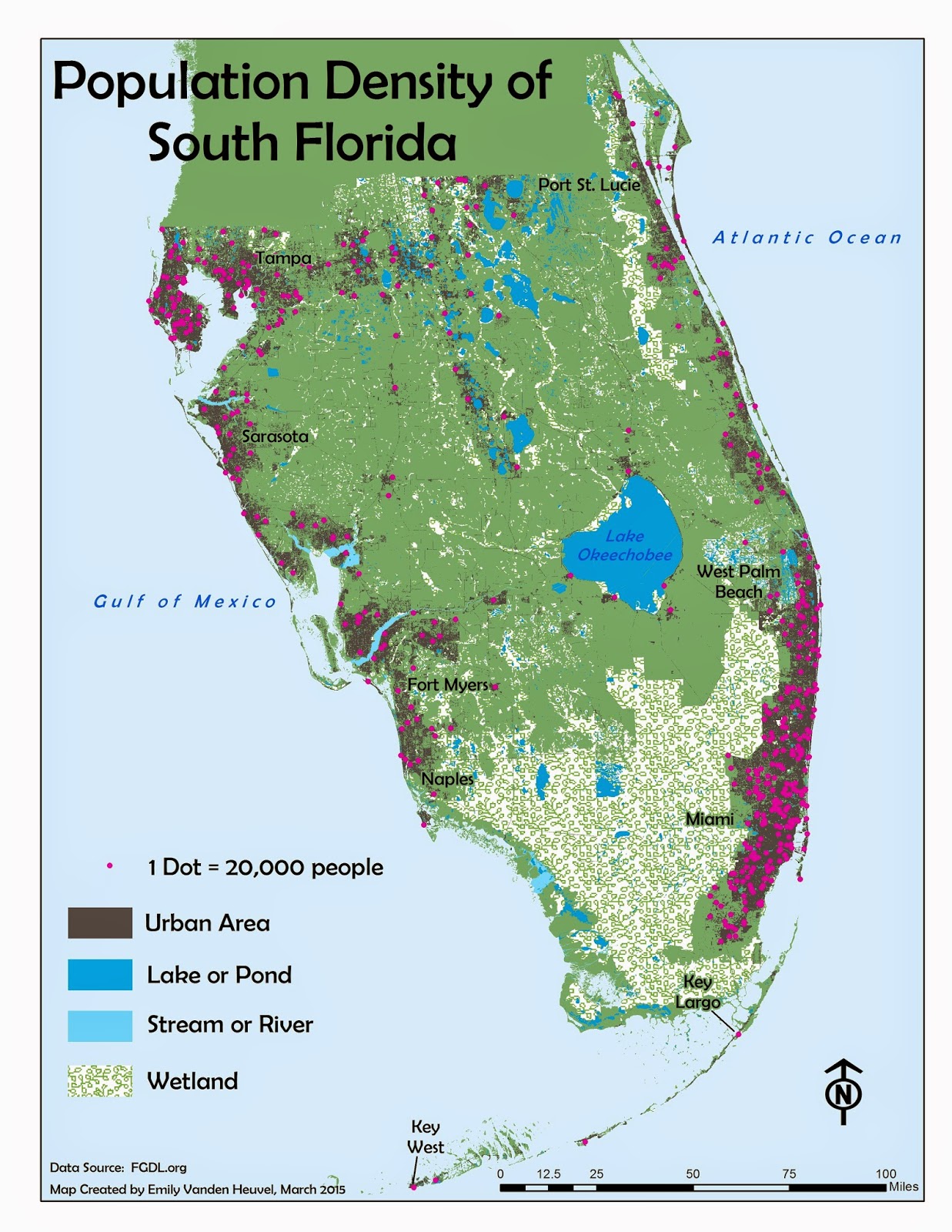
The method of execution here is pretty straightforward- 1 dot equals some amount (such as number of people, in the map above), and the dots are placed in the general location of where the measured amount occurs. The above map also places the dots in the darker shaded "urban areas," which further isolates the general population centers by location. Maps like this are a useful way to depict the density of some discrete phenomenon- like population. This type of map would be inappropriate to use for continuous phenomena, like temperature or precipitation, as those variables do not occur, and thus cannot be measured and isolated, at exact locations. The most densely populated areas of south Florida are along the coasts, with centers in West Palm and Miami/Ft. Lauderdale in the east, and Tampa, Sarasota and Ft. Myers/Naples in the west. This pattern is easily and simply visible with the locations of the representative dots in the above map.
As a side note, it probably wasn't necessary to include a label for Naples in this map, but I couldn't help myself and added it anyway. Ft. Myers is a bigger city, and more of the population's center, but Naples is my home, and thus my personal center locale. I suppose there is, to some extent, a least a bit of subjective reasoning one can allow for in these situations- or at least I hope that there is. Maps are, after all, generally rather scientific in nature, but still created by human beings...
The method of execution here is pretty straightforward- 1 dot equals some amount (such as number of people, in the map above), and the dots are placed in the general location of where the measured amount occurs. The above map also places the dots in the darker shaded "urban areas," which further isolates the general population centers by location. Maps like this are a useful way to depict the density of some discrete phenomenon- like population. This type of map would be inappropriate to use for continuous phenomena, like temperature or precipitation, as those variables do not occur, and thus cannot be measured and isolated, at exact locations. The most densely populated areas of south Florida are along the coasts, with centers in West Palm and Miami/Ft. Lauderdale in the east, and Tampa, Sarasota and Ft. Myers/Naples in the west. This pattern is easily and simply visible with the locations of the representative dots in the above map.
As a side note, it probably wasn't necessary to include a label for Naples in this map, but I couldn't help myself and added it anyway. Ft. Myers is a bigger city, and more of the population's center, but Naples is my home, and thus my personal center locale. I suppose there is, to some extent, a least a bit of subjective reasoning one can allow for in these situations- or at least I hope that there is. Maps are, after all, generally rather scientific in nature, but still created by human beings...
Monday, March 16, 2015
Flowline Maps and Static Movement
The concept of depicting movement with a static, 2 dimensional map may seem counter-intuitive, but cartography has an answer to this problem- the flowline map. Using lines and/or arrows of varying size/thickness to depict relative (or absolute, depending on the data) size or volume of whatever characteristic portrayed, flowline maps can also use the arrow and line placement to give an idea of the origination and destination of movement.

The relative sizes of the arrows in this map are proportional to the number of immigrants to the U.S. from each region, with the actual numbers in the legend in the lower right-hand corner. The inset choropleth map in the lower left corner depicts the percent of the total immigrants to each state- the amount increasing with the darkness of the color shade. At a glance the map viewer gets an idea of the relative volume and origination region of immigrants moving to the U.S., using a static, 2-dimensional map. I used a drop-shadow effect throughout, to give a bit of figure-ground contrast and emphasis for the arrows, inset map and title, without making them stand out too much. The overall visual impression is one of relative 3-dimension and movement, using an entirely 2-dimensional space.
The relative sizes of the arrows in this map are proportional to the number of immigrants to the U.S. from each region, with the actual numbers in the legend in the lower right-hand corner. The inset choropleth map in the lower left corner depicts the percent of the total immigrants to each state- the amount increasing with the darkness of the color shade. At a glance the map viewer gets an idea of the relative volume and origination region of immigrants moving to the U.S., using a static, 2-dimensional map. I used a drop-shadow effect throughout, to give a bit of figure-ground contrast and emphasis for the arrows, inset map and title, without making them stand out too much. The overall visual impression is one of relative 3-dimension and movement, using an entirely 2-dimensional space.
Tuesday, March 3, 2015
Isarithmic Maps
As with many things we see from day to day without technical knowledge of, isarithmic maps are fairly commonplace, and yet their creation and technical details are many. Weather maps, showing temperature or barometric pressure across a region with differently colored bands, are isarithmic maps. The prefix "iso-" means "same," and, as such, isarithmic maps display distribution of equal values with lines, like contours on a topographic map depicting differing elevations.


The 2 maps here use the same data, annual precipitation of Washington state, but employ different methods of classification and display. The first map uses hypsometric tint, which shades the areas between contour lines (lines representing equal values) with different colors according to their values, and the value ranges shown in the legend. The second map, below the first, uses continuous tones, and has an overlay of the actual contour lines. Continuous tone symbology shades each point on the surface with a color according to its value. Thus the main difference between the maps is the top simply shades the areas between the isolines (lines with equal values) with different colors, and the bottom considers, and displays with a corresponding color, each point's value. Both methods rely on spatial correlation- or the idea that values closer together in space have more in common than values further apart, and both use interpolation to calculate the values between exact places where measurements are taken. (The exact method of interpolation for this particular data is discussed in more detail in the paragraph in the right corner of each map.)
Creating 2 maps using the same data, but employing different methods of actual mapping, or display, is an excellent way to fully grasp a concept. The maps above are visually similar, but are clearly not exact copies, and I was able to gain intimate knowledge of their differences through this exercise. Yet another step taken towards becoming an able and competent GIS professional.
The 2 maps here use the same data, annual precipitation of Washington state, but employ different methods of classification and display. The first map uses hypsometric tint, which shades the areas between contour lines (lines representing equal values) with different colors according to their values, and the value ranges shown in the legend. The second map, below the first, uses continuous tones, and has an overlay of the actual contour lines. Continuous tone symbology shades each point on the surface with a color according to its value. Thus the main difference between the maps is the top simply shades the areas between the isolines (lines with equal values) with different colors, and the bottom considers, and displays with a corresponding color, each point's value. Both methods rely on spatial correlation- or the idea that values closer together in space have more in common than values further apart, and both use interpolation to calculate the values between exact places where measurements are taken. (The exact method of interpolation for this particular data is discussed in more detail in the paragraph in the right corner of each map.)
Creating 2 maps using the same data, but employing different methods of actual mapping, or display, is an excellent way to fully grasp a concept. The maps above are visually similar, but are clearly not exact copies, and I was able to gain intimate knowledge of their differences through this exercise. Yet another step taken towards becoming an able and competent GIS professional.
Subscribe to:
Posts (Atom)