Showing posts with label GIS3015. Show all posts

Thursday, April 9, 2015

Google Earth & KML

GIS is a powerful tool, not only for making maps that previously would have been painstakingly time-consuming to create by hand, but also for easy and rapid spatial analyses.  This week we explored some of the ways that modern GIS and cartography are changing with new technology and the modern zeitgeist, and delved into creating KML files for use in Google Earth.


This screenshot is a Google Earth image of downtown St. Petersburg, taken from a KML file with a "tour" of various locations in south Florida.  The map layer information, visible when the layers are turned on and the image is zoomed out, was created by exporting the info directly from ArcGIS to the KML file format, and loaded into Google Earth.  Though the Google platform lacks the ability for visual modification and analysis present in ArcGIS, it is a free download, as opposed to the many hundreds of dollars required for the ESRI product.  KML files create an opportunity for sharing GIS information that previously was only available to those with the necessary software, as anyone with a computer and an internet connection can download and use Google Earth free of charge.  

Monday, March 30, 2015

Mapping in 3 Dimensions

One of the more interesting developments of creating maps in the 21st century is the ability to to create and view maps in 3D.  A 3 dimensional map can be a superior visual method to portray features both above and below the earth's surface, and can also assist in spatial analysis.  


This is a jpeg export of a 3D scene of Crater Lake, Oregon, to which I have added vertical exaggeration for effect.  One of the more creative aspects of 3D mapping is the cartographer's license to modify features as such- as a tool to better illustrate the map's vertical relief.  When opened in ArcScene the above graphic can be navigated in 3 dimensions, with the surface rotated to show the relief above, or below.  Different layers can also be added to this surface for spatial and/or visual analysis.  There are increasing opportunities for these kinds of 3 dimensional portrayals in GIS and map-making, which will likely only increase with future advances in computers and technology.

Tuesday, March 24, 2015

Dot Mapping

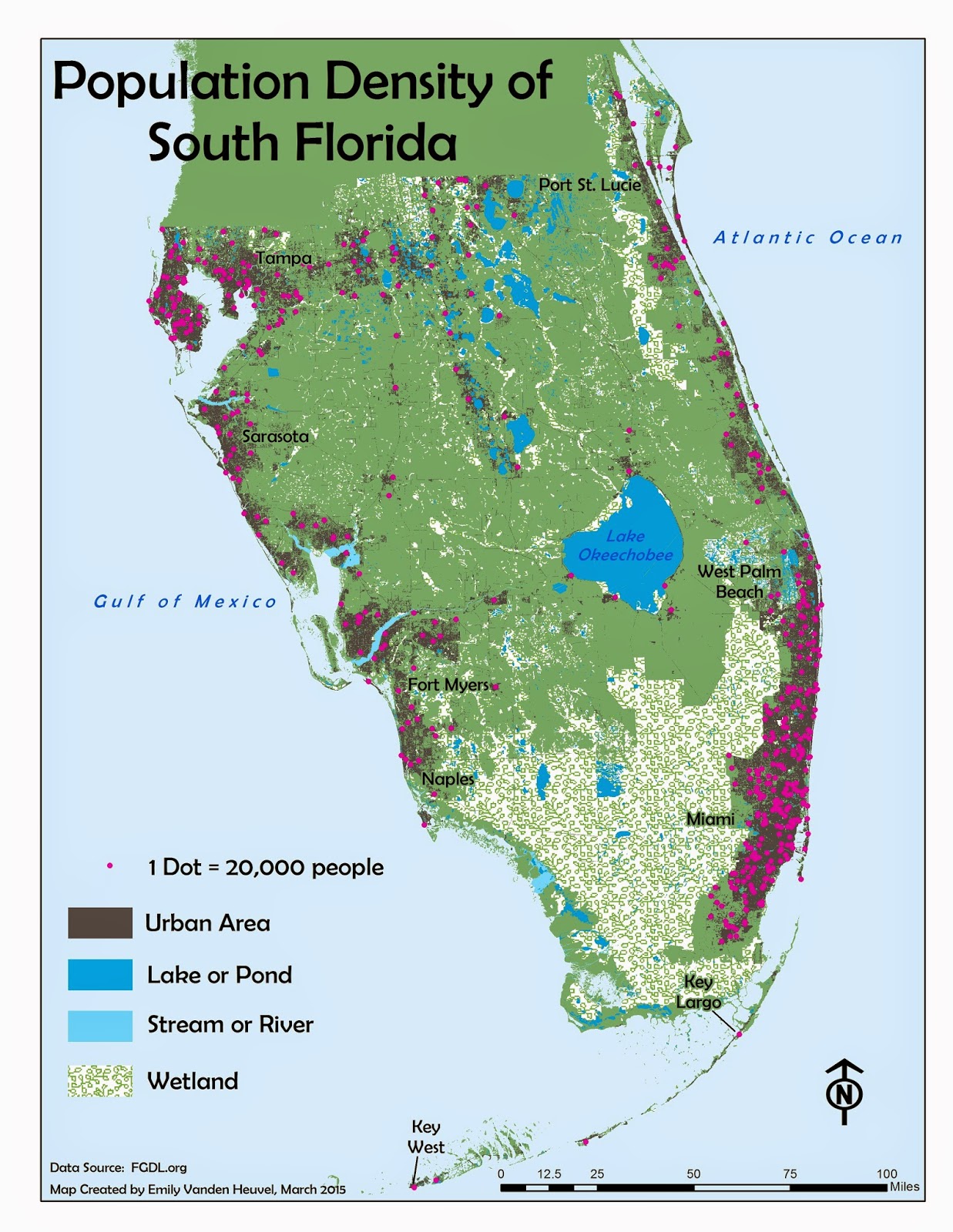
This week's thematic map content involves dots- specifically those that represent a number measure of some discrete phenomenon, and are placed on a map according to the phenomenon's general location.  Viewing a map such as this provides a good visual of the density of the map's theme.


The method of execution here is pretty straightforward- 1 dot equals some amount (such as number of people, in the map above), and the dots are placed in the general location of where the measured amount occurs.  The above map also places the dots in the darker shaded "urban areas," which further isolates the general population centers by location.  Maps like this are a useful way to depict the density of some discrete phenomenon- like population.  This type of map would be inappropriate to use for continuous phenomena, like temperature or precipitation, as those variables do not occur, and thus cannot be measured and isolated, at exact locations.  The most densely populated areas of south Florida are along the coasts, with centers in West Palm and Miami/Ft. Lauderdale in the east, and Tampa, Sarasota and Ft. Myers/Naples in the west.  This pattern is easily and simply visible with the locations of the representative dots in the above map.  

As a side note, it probably wasn't necessary to include a label for Naples in this map, but I couldn't help myself and added it anyway.  Ft. Myers is a bigger city, and more of the population's center, but Naples is my home, and thus my personal center locale.  I suppose there is, to some extent, a least a bit of subjective reasoning one can allow for in these situations- or at least I hope that there is.  Maps are, after all, generally rather scientific in nature, but still created by human beings...    

Monday, March 16, 2015

Flowline Maps and Static Movement

The concept of depicting movement with a static, 2 dimensional map may seem counter-intuitive, but cartography has an answer to this problem- the flowline map.  Using lines and/or arrows of varying size/thickness to depict relative (or absolute, depending on the data) size or volume of whatever characteristic portrayed, flowline maps can also use the arrow and line placement to give an idea of the origination and destination of movement.


The relative sizes of the arrows in this map are proportional to the number of immigrants to the U.S. from each region, with the actual numbers in the legend in the lower right-hand corner.  The inset choropleth map in the lower left corner depicts the percent of the total immigrants to each state- the amount increasing with the darkness of the color shade.  At a glance the map viewer gets an idea of the relative volume and origination region of immigrants moving to the U.S., using a static, 2-dimensional map.  I used a drop-shadow effect throughout, to give a bit of figure-ground contrast and emphasis for the arrows, inset map and title, without making them stand out too much. The overall visual impression is one of relative 3-dimension and movement, using an entirely 2-dimensional space.

Tuesday, March 3, 2015

Isarithmic Maps

As with many things we see from day to day without technical knowledge of, isarithmic maps are fairly commonplace, and yet their creation and technical details are many.  Weather maps, showing temperature or barometric pressure across a region with differently colored bands, are isarithmic maps.  The prefix "iso-" means "same," and, as such, isarithmic maps display distribution of equal values with lines, like contours on a topographic map depicting differing elevations.


The 2 maps here use the same data, annual precipitation of Washington state, but employ different methods of classification and display.  The first map uses hypsometric tint, which shades the areas between contour lines (lines representing equal values) with different colors according to their values, and the value ranges shown in the legend.  The second map, below the first, uses continuous tones, and has an overlay of the actual contour lines.  Continuous tone symbology shades each point on the surface with a color according to its value.  Thus the main difference between the maps is the top simply shades the areas between the isolines (lines with equal values) with different colors, and the bottom considers, and displays with a corresponding color, each point's value.  Both methods rely on spatial correlation- or the idea that values closer together in space have more in common than values further apart, and both use interpolation to calculate the values between exact places where measurements are taken.  (The exact method of interpolation for this particular data is discussed in more detail in the paragraph in the right corner of each map.)

Creating 2 maps using the same data, but employing different methods of actual mapping, or display, is an excellent way to fully grasp a concept.  The maps above are visually similar, but are clearly not exact copies, and I was able to gain intimate knowledge of their differences through this exercise.  Yet another step taken towards becoming an able and competent GIS professional.


Monday, February 23, 2015

Choropleth & Graduated/Proportional Symbol Mapping

Data classification appears to be an ongoing theme here- and with good reason.  Simply put: it is not simple, nor easy to do.  Choropleth maps sound very complicated, and most people are not familiar with the term "choropleth," and as such it is a word I like to throw around in casual discussion of my classes. It makes the work I'm doing sound very difficult and technical (which it is, to some degree).  The truth is that it's a term used for a map that displays some characteristic within administrative boundaries, or enumeration units.  Graduated or proportional symbols are another method of displaying some characteristic, with their placement on a map coinciding with their incident geographic location.


Choropleth maps are, as the one here, often used to display population characteristics based on administrative units, such as countries, states, cities, etc.  The population density in the uppermost frame is shown in shades of green, with the highest density values being the darker shades, and the values decreasing with the lightness of the color.  The bottom frames, with the population percentages by gender, follow this pattern as well- darker shade means higher value, lighter means lower.  With this type of map population patterns are easily revealed, as the top map clearly shows higher population density in western Europe in comparison with the countries in the east.  Again, as we found last week, the classification of the data values is of paramount importance here.  We want to display on the map what is actually true in the real-world, and thus must take care to place each country in a class with members as alike to each other as possible, and as different to values in other classes as we can.  The top map had a few statistical outliers in the population density measure, as there are countries in Europe that are very, very small (Vatican City, Malta, etc.) and have very, very high density values.  These anomalous nations are not visible in a map of this scale, and so are placed in a class with a few countries with much lower values, but easier visibility on the map.  The wine consumption, in liters per capita, is displayed by circles that increase in magnitude as the per capita consumption increases.  Again, placing the countries in classes of different value ranges helps depict a visual pattern, with consumption generally greater in western Europe.  I employed the natural breaks method of classification for that, as I feel it is an accurate way to group the countries by that value.  

All in all, mapping statistics isn't the simplest thing to do, but, like anything else, it becomes easier with practice.  This week's maps seemed daunting at first, but through creating them I can honestly say I have, once again, broadened my understanding of this subject.  I will probably still occasionally obliquely refer to the complicated nature of the choropleth map in casual conversation though, as opportunities to successfully slip such arcane and technical terms into a discussion will always be somewhat gratifying.

Tuesday, February 17, 2015

Classifying Data: for a Map that Makes Sense

Appropriate data classification is one of those things that, though we are mostly unconscious of, can really mean the difference between a map that logically displays data accurately, and one that is imprecise and misleading.  When one creates a map that is meant to display some characteristic phenomena, like population percentage of a specified age, by division of some administrative boundary, like state, county, or census tract, one must choose carefully the categories that each administrative unit is placed in.  The technical term for this type of map is choropleth, and there are several different ways the data categories, or classes, can be decided.  


Through my creation of the above I personally discovered some of the challenges in deciding which classification method is most appropriate for accurate depiction of the characteristic phenomena being mapped.  The 4 maps are all displaying the same raw data- census information on the population percentage of adults 65 and older in Escambia County, by census tract area.  They differ in how they display that data, namely how the different percent values for each tract are grouped and shaded the same, or are classified, to create a map that accurately shows the viewer a general idea of the distribution of this population characteristic throughout the county.  The 2 bottom maps classify the data with the quantile and equal interval methods, which divide the values without consideration of where the natural groupings of values occur within the range.  The upper right map classifies values according to their distance from the mean percentage, and the upper left uses algorithms to determine the most accurate "natural breaks" in values, in order to minimize the difference between values in the same class, and maximize the difference between values in different classes.  Upon close inspection, in my opinion, there aren't many huge differences between the maps, and yet I was asked, as part of the assignment, to choose, and defend my choice of, which is the superior method of accurately displaying the actual data.  This was a bit of a challenge.  I concluded the superior method is the natural breaks, but a decent case could be made for any of the other 3.  This type of challenge becomes especially politically, and emotionally, loaded when one is mapping some characteristic like race, political affiliation, or crime statistics, as the decision to place areas in one category or another can be a cause of consternation for some.  One also has the ability, in certain situations, to present the raw data in a misleading fashion according to how it is categorized- in which situation certain causes can be championed, etc.  All in all, it's a very important lesson for a nascent cartographer to learn, as these issues may not be immediately evident in the process of map creation or assessment. 

Sunday, February 8, 2015

Statistics... of the *Spatial* Variety

I know the sentiment probably isn't popular amongst my classmates, but I have always rather enjoyed statistics.  The idea of describing and predicting phenomena, be it natural or man-made, with math is fascinating to me.  Spatial statistics are an especially important facet of geographic science and GIS; describing the "why of the where," as a professor I once had put it, is one of the discipline's prime directives, and cannot be done without statistical analysis.  


The above is a map, created in ArcGIS Desktop, of weather monitoring stations in Western Europe.  This map of points presents a convenient set of data with which to perform some basic spatial analysis of central tendency- such as the calculation of the mean and median centers of station distribution.  The green shaded oval shows the general trend of distribution, using the number of stations within one standard deviation of the mean.  These analyses were relatively simple to perform with GIS, and undoubtedly represent only a small fraction of what the program can do with statistics.  My exposure to these capabilities, up to this point, has been nonexistent, and I greatly look forward to exploring them as I progress in this program.    

Monday, February 2, 2015

Typography and Labeling (the good kind)

Labels are an essential element of maps that we probably take for granted.  The font, color, size, position, etc. of the map labels can mean the difference between immediate recognition of the map's meaning and intended purpose, and the unpleasant task of squinting and muttering unpleasant phrases by the map reader attempting to decipher the map content.  We actually got to read up a bit on typography this week as well, which is an interesting subject to an amateur graphic designer such as myself.  The discipline of cartography, as one might imagine, has many specific and proprietary design conventions, including those involving text and labels.  


Effectively and clearly labeling a map of one of the Florida Keys is the perfect exercise in both cartographic labeling skills, and beginner's frustration-threatening-to-become-blind rage at the intricacies and idiosyncrasies of Corel Draw.  Suffice it to say I spent many an hour creating and making minute changes to the above map, and (hopefully) gained some decent skills in effective design and placement of map labels. 

I wanted also to add interest to the design of the map itself, without distracting too much from the actual content, and so decided to make the map's background a gradient of white and blue.  I went with a clear and readable sans serif type for the letters on the map's labels, and added a white halo behind some of them to allow them to stand out a little better.  I used differently styled labels for the Keys themselves, the cities and water bodies, which ideally allows the map reader to instantly recognize which is which.  Corel Draw remains a bit of a challenge for me, but I do notice an improvement in my ability to wield it effectively each time I use it. 

Thursday, January 29, 2015

Map Design and Composition (with a touch of Gestalt)

Map design and the principles of cartography are a bit of a theme this week, it would appear.  Gestalt Theory comes into play in this as well, which is of interest to me, as the whole "seeing the forest for the trees" and "the whole is more than the sum of its parts" ideas of cognition always fascinated me in psychology courses.  The Gestalt ideas of perception are useful when it comes to designing an effective map- namely in considering how the various map elements will be perceived by the map user.  Concepts like Similarity (cognitively grouping objects according to their general shape) and  Figure-Ground relationships (perceiving certain objects as closer, and thus more important, based on their relative size) come into play in the design of an effective map.

  
In consideration of these Gestalt principles I used the same symbol for the 3 different types of schools, but changed the size and color to differentiate between elementary, middle and high schools.  Their shape similarity ideally allows the viewer to immediately recognize that all of the point symbols are schools.  I also made the school symbol colors more vibrant and saturated against a more subdued and pastel background palette, which allows them to better stand out, as they are the main thematic content of the map.  The background information, like streets and parks, are shaded in the lightest grey possible, which allows for a certain level of visibility, but doesn't interfere visually with the more important mapped features.  

Tuesday, January 20, 2015

CorelDraw, Graphic Design and Losing Time

Graphic Design is a skill I greatly admire, but one that I have no formal training in- I have used Adobe Illustrator and Photoshop in GIS positions I've held, but I am entirely self-taught.  For this reason I found this week's assignment, using CorelDraw to modify a basic map, quite intimidating.  I must admit, however, that I had forgotten how easy it is to slip into the "flow" when creating and editing a design project, to lose track of time, and experience the satisfaction of attempting to tweak something to (relative) perfection.


This was the final product of my efforts, and I am a little embarrassed to admit how much time I spent creating and modifying the above map.  (it was a lot.  I spent a lot of time.  Let's not worry about exactly how much.)  It wasn't that it was difficult, per se, but that it's easy to fall into kind of a trance-like flow of moving and re-sizing, changing colors, etc.  

I feel satisfied with the above submission, but am interested to see what kind of grade I receive for it.  I also enjoyed working with CorelDraw, as I found it similar enough to Adobe Illustrator that I was able to pick it up easily.  Overall I was relatively pleased with all aspects of this week's work.     

Monday, January 12, 2015

Map Critique

This week's task finds us reviewing examples of "good" and "bad" maps, and evaluating them using Edward Tufte's 20 points from his The Visual Display of Quantitative Information. The maps below are my choices of quintessential good, and bad, according to those criteria.


(map produced by Medford District BLM)

I feel the above map embodies Tufte's calls for both simple design with lack of clutter, and clear depiction of the data it intends to convey.  The viewer can immediately and easily identify the content pictured in the legend, and draw whatever conclusions necessary about the relationship between land ownership and watershed boundaries.  The inset map on the side is an elegant and simple way to convey to the viewer the map extent within the larger context of the state, without using unnecessary space within the mapped area's extent.


 (map produced by R. Reed)

The above appears to be a bus map of central London, which becomes evident upon inspection of the labeled roads and parks.  The map conspicuously lacks a title, an important piece of information that, along with a scale bar, Tufte logically advises be present.  London is an ancient and densely populated urban center, which lacks any kind of large-scale planning or grid pattern in its roads, and anyone attempting to produce a simple and easy-to-read map of the city faces a formidable challenge.  The author of the above appears to give in to the temptation to include many possible details, and in doing so creates a map that is busy, cluttered and visually unappealing.  Tufte advises avoiding this, as the cluttered picture obscures the main points the data is meant to convey- which, in this instance, are central London bus routes.


Wednesday, January 7, 2015

Allow me to introduce myself-

My name is Emily, and I am working on a Master's degree in GIS through the University of West Florida.  I suppose I could be referred to as a "map enthusiast" of sorts.  At any rate, I intend to resurrect my career working with GIS, and surmised that the optimal way to do so at this point in my life is through more rigorous academic pursuits.

I'm a Michigan transplant currently residing in south Florida, but I've moved about quite a bit.  Here is a story map with some of the highlights:
http://bit.ly/1yC2kkf

I must say that I am looking forward to the challenge of re-entering the academic world after a decade plus hiatus, and sincerely hope I shall once meet with success as a student...